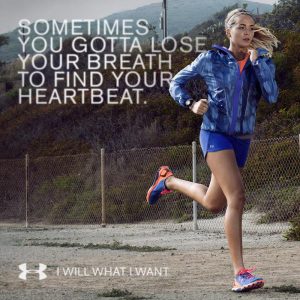
Background:
Since 1996, Under Armour have shown their longing to make athletes better. They became popular with the male public, although they were not trendy among the female public. Taking into consideration the growth of female consumers, Under Armour started to focus more on women. In 2014, they launched the “I Will What I Want” campaign, trying to make an impact by incentivizing women to face challenges, run the extra mile, believe in themselves without listening to the “background noise”. They used the help of famous women athletes to create their ads by sharing their stories, difficulties and perseverance. Under Armour have demonstrated through this campaign that every woman can do whatever they want and succeed. They have utilized good color selection and focused on using powerful words to create the aids.
Original Source:
Alignment:
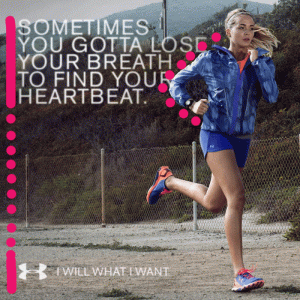
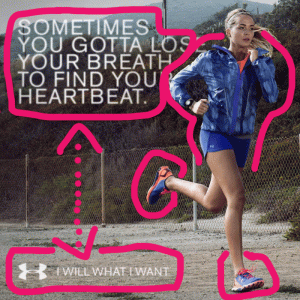
They have used left-alignment to create organization between the texts, bringing strong lines and a sophisticated look. The elements on the page are placed in a way that it is easy for the reader to focus their attention. They also have purposely filled the space between the woman and the first text, which created unity and organization between the elements as well.
Repetition:
This ad shows consistency through the entire page. They have used the same font and color for the top and bottom texts, and they have used the colors blue and orange for the woman’s outfit. It is interesting to see that they don’t abuse on repetition, but they followed the same pattern on the top and bottom of the image creating this nice consistency.
Contrast:
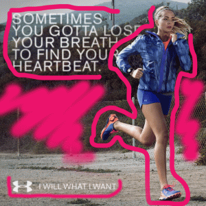
There is a good contrast between the elements on the image. They have used the colors blue and orange to distinguish the woman from the rest of the elements making it very easy to identify one from another. The texts are different in size and using white for the texts also helped to contrast with the shades of green from the background. The bottom text shows a little bit of contrast, but not so much since the ground light color is very similar to the text’s white color. Still, I believe that it looks harmonious because the focus is really at the top of the image and it is also nice to have a clear white space to not look so crowded.
Proximity:
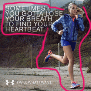
This ad also shows nice principles of proximity. The text at the top is separated from the text on the bottom, but close to the elements that it is supposed to be close with. It seems like the text is referring to the woman’s actions, therefore they are also grouped together in a very nice way.
Color:
They have used blue, orange, white and it seems like a few shades of dark green and brown on the background. Using the color wheel concept, I would say that they played with the orange, blue and green tried sequence. The colors are harmonious and feet well for this type of advertisement. The blue brings a sense of calmness and focus, while the orange brings life and energy. The dark background and the white color for the texts had a good contrast. I really like these colors together.
Conclusion:
This ad was well planned and followed all the four principles: Alignment, Repetition, Contrast and Proximity. We are able to identify the separate elements from the image. Additionally we can see the focus on the top text with a bigger size from the one on the bottom, as well as, the focus on the woman figure. They have created strong lines, unity, and organization. The contrast is well thought out with the different colors and sizes to distinguish the elements. This ad shows consistency by repeating a few important elements to bring a sense of closure to the image. All the elements are grouped in the right way and the colors work together very well. It is incredible how we can identify so many principals in one ad and how our minds focus better when the image is organized, unified and harmonious.
0 Comments