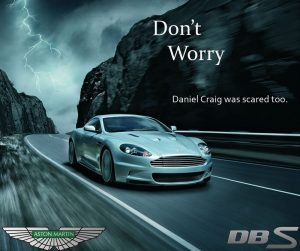
Image by: http://www.chelidae.com/tag/cars/
This ad is from the Aston Martin car manufacturer. This is a sports car version of their DB9 called DBS. This is a luxury car like so many other cars that they also market. Daniel Craig, the actor from James Bond 007, helped cause an impact on this advertisement by driving this vehicle. His name was used in this ad to drive interest in this vehicle for those wanting to be like Daniel Craig racing a luxury car.
Analysis:
Typeface #1
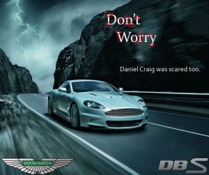
After scanning “Don’t Worry” using fontsquirrel I’ve determined that the font used is probably “Editor” designed by Jean-Baptiste Morizot and published by Indian Type Foundry. This font is from the serif font family. The styles in this font appear to be popular in news articles. This font features “prominent wedge-shaped serifs and visible stroke contrast”link. It appears to be of the category Oldstyle. We can see moderate thick to thin transitions, the serifs have a slightly slanted angle and the “O” seems to have a slight diagonal stress.
Typeface #2

The second typeface of the text “Daniel Craig was scared too” is of the font family sans serif. Using fontsquirrel, the font that appeared most like the font used for this text was the Ainslie Sans font published Insigne Design. This font lacks the use of serifs. The letters are more rounded on the edges and there are no thick to thin transitions causing no stress in the letters.
Contrast:

I noticed in this advertisement the sharper edges from the serifs and the thick to thin transitions in the first typeface. These attributes draw the eye to this text first and then the viewer reads the following line in the different typeface. The first typeface contrasts with the second typeface text because it has serifs, moderate thick to thin transitions, a bigger font size and bolder words. In contrast, with the second typeface which has no serifs, it is simple, has no weight and no stress, and is in a smaller font size. Consequently, a result of the font use is that the texts in this advertisement are easy on the eye to read, showing great impact and contrast.
Conclusion:
Using different typefaces helped portray different weights to the texts in this image. In the case of this advertisement two typefaces were used. We know exactly where our eyes should go first. The car in the middle of the image calls the attention, then our eyes move to the first typeface in big letters and then to the second typeface in small letters. The two typefaces are aligned to the right and flow well with the movement of the car. They have used the space available on the right, which is organized, and also gives the sensation that the letters are moving along with the car. This is a powerful ad, although the typefaces are simple they show elegance, great impact, and connection with the image.
0 Comments